Creating A Shorthand
- Overview
- Why make a shorthand or custom cursive orthography?
- What I made
- Set Some Goals
- Understand your limitations
- Understand that everything is a tradeoff
- Fonts for Shorthands
- It’s hard to be simple
- Learn from those who came before
- Prioritize your goals
- It will never be perfect
- No-one cares
- Keep track of your changes
- It doesn’t even have to be useful.
- Resources
- Looking Back on Korthic
Overview
A look back on the experience of creating my own shorthand, and advice for those who might want to attempt the create one of their own.
Why make a shorthand or custom cursive orthography?
There are lots of reasons one might want to. Kids create secret cyphers for sharing notes with friends, or keeping their diaries private. Adults do that too, but some of us do it for the challenge, and some of us do it because the existing options just don’t work well for our brains, or bodies.
Creating your own shorthand is a fun and creative exercise. Creating a cursive shorthand brings a series of additional challenges related to how letters connect, and how words flow across the page. I’ll write more about this below.
Writing longhand is also incredibly rewarding, because it uses different parts of your brain, and forces you to interact with language differently. Doing so in a script that’s designed specifically for your needs, and desires feels great.
What I made
Korthic Shorthand is a cursive shorthand created to solve the problems I was encountering using standard printed, or cursive English lettering. It’s a 1:1 substitution for the Latin alphabet, just like longhand is a 1:1 substitution for printed letters.
As shorthands go, it’s very simple. No phonetic spellings, and only two “shortened forms” for common words.
I suspect that future versions of it will have phonetic spellings, but for reasons I’ll get into later, I chose to release it without that.
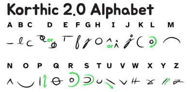
A screenshot of the Korthic alphabet.
Set Some Goals
The most important thing you can do is describe the problem you’re trying to solve, and set some goals.
I had the following goals for Korthic:
- a cursive that doesn’t bother my wrists after many pages of writing
- (mostly) stays on a horizontal line
- works well on tablets
- produces words whose meaning is unambiguous and easy to read.
- no memorizing long lists of special cases
- aesthetics that make me smile
Note that speed was not something I was striving for. I don’t need to transcribe written speech. I need something that’ll be “fast enough” for me to write scenes for my novels without frustrating me.
My aesthetic goals are purely subjective. More importantly, they’re not subject to what anyone else thinks. I only need to make myself happy. That being said, I have received unprompted compliments on it from people who happened to see me writing.
Understand your limitations
In my case there were two big limitations that I was trying to overcome. The first is that after only a couple pages of printing my wrist starts to hurt. Writing in standard cursive solves this, but at speed I end up with words whose letters I have trouble trying to decipher. Transcribing my scribbles became an exercise in frustration.
However, writing many pages in both forms taught me about what I could realistically expect of myself.
Precision was, very clearly, not something I could rely on.
Grafoni - for example - looks great. It’s got a printed and cursive form, and both look clear, and seem easy to read.
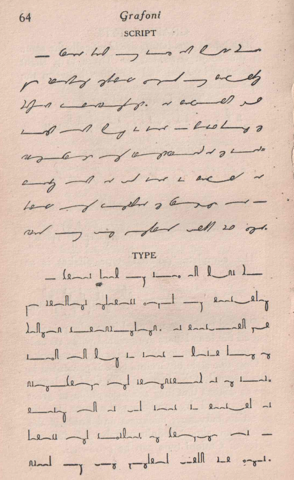
An example of Grafoni's two writing styles
I was excited to use it, until I looked closer.
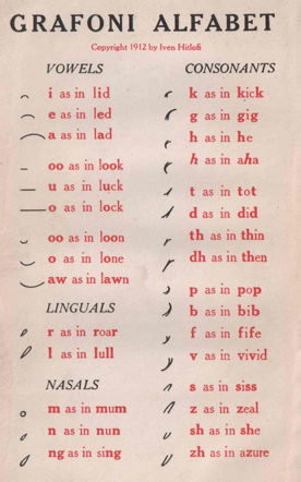
The Grafoni Alphabet.
After writing enough pages of cursive English, it was clear to me that I’d never be able to clearly write different upwards curves of slightly different lengths and be able to tell one from another. I gave Grafoni a try, just to be sure, but I walked away confident it’d never meet my requirement of creating words with unambiguous spellings.
I can differentiated between “wide” and “small” letters though. In Korthic the “t” and the “o” are both downward curves like a “u” but the “o” is always written significantly wider. There are a couple other letter pairs like this. How wide my “o” is drawn can differ significantly from word to word, but it’s still pretty obvious that my “t” shape is trying to be a “small” letter and my “o” is trying to be a “wide” letter. In the end
Understand that everything is a tradeoff
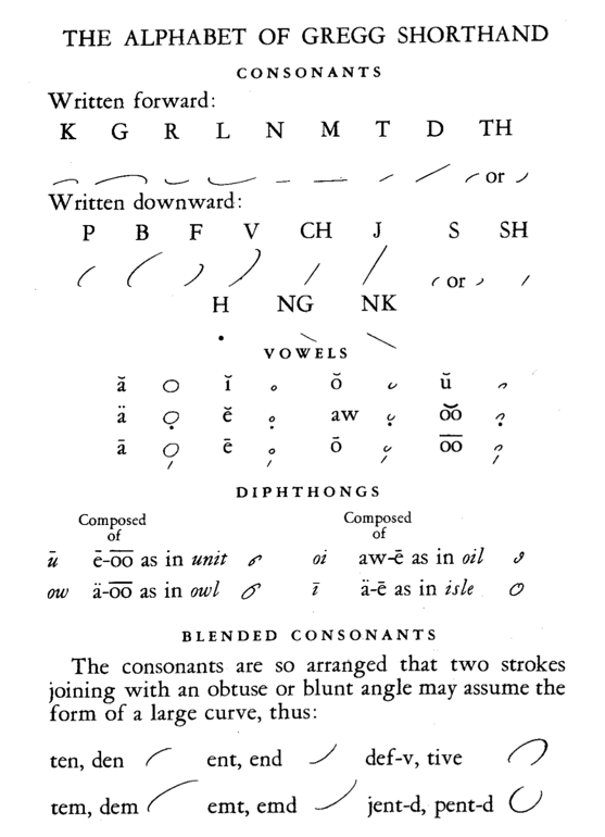
Gregg shorthand - for example - prioritizes speed over most things. It’s a brilliant cursive shorthand, with lots to lots to learn from studying it, but it also has hundreds of “shortened forms” it expects you to memorize. For example, the word “husband” is written like a lower case “i” with a tiny bit of flourish. Its spelling is phonetic, and it has a bunch of special rules, and shapes that are similar enough that I’m reasonably confident anything I tried to write quickly with it would be very hard to read.
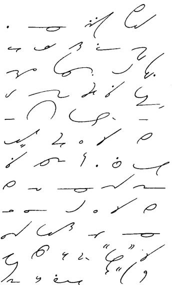
An example of Gregg Shorthand
Fast meant using phonetic spelling so that you don’t have to write every letter. It meant memorizing and using “shortened forms” for common words. The phonetic spelling is limited, and the result is that it’s really hard to guess the correct pronunciation when you encounter a person’s name in Gregg Shorthand. It meant big looping shapes that required almost no lifts of your pen except to start a new word.
Fonts for Shorthands
Creating a font has become surprisingly easy. Especially with apps like BirdFont, and the idea of having a font for your shorthand is probably enticing. The problem is that font systems are fundamentally all about letters fitting into a grid. Chinese characters seem like an exception to this, but they’re really not. Yes they represent words, but functionally they’re just more complicated characters on a grid.
A font could be created for something that resembles characters in a line, like Grafoni. Something that was made up of central shapes with diacritics around them - think letters or Chinese characters with marks nearby - could also be made into a font, as long as the characters proceed linearly.
However, many shorthands have a tendency to wander vertically as one letter / sound connects to the next and that’s just not compatible with how fonts work.1
So, if you’d like to be able to type on your keyboard and have it look like your shorthand, then you’ll need to guarantee that what you design is extremely linear.
It’s hard to be simple
The more you want your writing to flow from one word to the next, the harder it is to have unique shapes. Grafoni and Gregg are good examples of this. Both systems have very few shapes
Grafoni’s creator decided that with precise control of width, or height, one could solve the problem of reusing the same shapes. And, as you can see above, has three sizes for each shape.
Gregg also reuses shapes, but - in my opinion - it’s far more clever about it. Gregg understood that speed and precision were at odds with each other. With Gregg, there are only small and large shapes, and the difference is pretty obvious in practice. Additionally, he understood that it’s hard to maintain angular joins when moving fast, and incorporated the natural curve that would result when trying to draw an obtuse angle quickly.
Gregg shorthand is a master-class of clever decisions, and practical compromises needed to enable professional stenographers accurately capture the live speech of people accurately enough for court documents.
Gregg Shorthand Alphabet.
Fast writing is inevitably going to be a lot of big and small loops, and horizontal lines. Making an abrupt change of direction, or lifting the pen to reposition it slows things down.
Because I was designing a cursive, where I wanted all the letters to connect, I encountered two big problems. The first was that it was difficult to find different shapes for letters that didn’t cause the pen to move up or down. The second was that any shape that ended up at a different level than it started causes words to spread vertically.
You can keep the number of shapes low, by introducing rules like Gregg’s that make it clear that in this situation a loop means this, but in that situation it means something else. Or, you can demand precision like Grafoni does.
Precision wasn’t an option for me. I’d learned that I can manage two sizes of a shape, and that mirroring shapes - either literally, or by drawing them in a different direction - was a practical form of reuse. Combined, these mean that any one shape can be used four times. Unfortunately it wasn’t until writing this paragraph that I actually put those facts together. This is - in no small part - because Korthic didn’t start from scratch, but is an iteratively modified descendent of Orthic.
My need for different letter shapes meant I only partially solved the problem. Here are some of the rules Korthic employs to help get around its problems.
-
“n” is just a bigger “i”, but when there’s just one in isolation it can be hard to tell which was intended. Context solves the problem most of the time. If you see a word that can be “one” or “oie” it’s a pretty safe bet that the author intended “one”. However, unambiguous letters was one of my primary goals. To address this, I added a rule that a dot over the “i” shape meant it was definitely an “i”. That rule also leverages a rule that English speakers will have already internalized.
-
“l” and “r” are both little loops on the line, but “r” is always drawn counter-clockwise and “l” is always drawn clockwise. This means that as you are writing from left to right, the “r” will always be on top of the line, and the “l” will always be on the bottom.
-
“c” and “s” are similar in that the direction they’re drawn in results in them being mirror images of each other.
-
“p”, “d”, and “k” can all be drawn upwards or downwards, and you can exit the large circle of an “h” at any point. Whenever a word is trending too far up or down, and it encounters one of these letters, it gives you an opportunity to shift the word in the opposite direction.
It’s not perfect though. Korthic’s “u” is a downward slant, and the word “succubus” provides me with no real opportunity to counteract the downward slant of its three separate “u”. I can’t allow users to optionally write “u” in an upward direction, because that’s a “y”.
-
“c” and “s” both allow you to continue writing along their baseline, or to angle back up to the height of where they started.
Learn from those who came before
Taking the time to learn the basics of Gregg was one of the most valuable steps in my journey to creating Korthic. I think anyone attempting to create a cursive of their own should take the time to do the same. Even though Gregg doesn’t work for my brain, and I ended up creating something that can’t possibly compete with Gregg’s speed, its lessons still informed many of my choices.
Trying to learn Grafoni was also very informative. It confirmed my belief that carefully controlling size was not something I was capable of. Gregg taught me that “obviously small” and “obviously large” don’t require precision, and are distinctions that I can make when writing. This means that, for me every shape could - in theory - be used twice.
Gregg also taught me how to mirror a shape for reuse, and that the direction you draw a shape in can be a clear signal as to which letter you intended. That’s how I ended up with “r” and “l” being identical shapes, that are still clearly distinguishable in actual practice.
My advice is to download, and skim through lots of shorthands. Find ones that look close to what you want, and try to use them. Make notes on what works, and doesn’t work in each one. It’s ok if these opinions are completely subjective, irrational, and / or emotional. You don’t have to justify your hot-takes to anyone. You’re just trying to find out what your brain likes, and learn from other people’s “mistakes” or “brilliant ideas”.
Stand on their shoulders
In your travels through existing shorthands you’ll likely find something that seems close to what you want. For your first shorthand, consider taking that almost - but not quite - shorthand, and modifying it according to the lessons you’ve picked up in your explorations.
Creating a truly usable orthography is a one of those subtly complex arts that you won’t really understand until you’ve done it a few times. Working from someone else’s foundation means starting from a point that’s already worked through many of the complications, and is known to work for at least someone. In a way it’s like having a safety net. When you try something that inevitably fails, you can have confidence that it’s just the thing you tried, and not the whole system, or its fundamental thinking that needs to be abandoned.
Prioritize your goals
Clarity was more important than speed, and - as I worked on Korthic - I learned that after ease of use, aesthetics were the key to making me smile. Because of this, my “e” ended up being extremely flexible. It went from a simple line that went down off of a horizontal line, to any near-perpendicular intersection of two lines without crossing.
It will never be perfect
The 1800’s seemed to be the Golden Age of shorthands, but it wasn’t a time of collaboration and iterative improvement. Instead each shorthand of the era starts with a small treatise on why it’s “objectively perfect” and “obviously superior” to every shorthand that came before it, or sometimes just to the one its author had a grudge against.
The truth is that different people have different minds, and different bodies. No shorthand is perfect for everyone. Korthic isn’t even perfect for me. It’s “u” being a downward slant results in words like “succubus” that go down, down, down and never get a chance to come back up. The “d” involves too much careful drawing for such a common letter.
But, it works for me, it solved my problems with readability, and wrist strain, and it makes me smile. Will I keep using it? Probably. Will I change it? Probably.
No-one cares
No-one cares about physical writing anymore. Cursive is a dying art. So much so that the US National Archives is desperate for people who can read cursive, and help them transcribe historical letters from the US Civil War.
The more technology advances the less need we people see for physically writing. Whisper can transcribe audio with great accuracy and speaker detection at many times the speed of its speakers. A good keyboard and a little practice will enable novices to type over 120 words per minute, and stenotype machines allow professional stenographers to reach upwards of 375 words per minute.
Even the people who are fascinated by shorthands won’t really care. They might say “oh neat” and wander off, but it’s unlikely anyone else will actually use what you create. Accepting this is incredibly freeing. People aren’t going to nitpick your creation, and it doesn’t have to satisfy anyone but you.
Thomas Hill’s shorthand is a great example of this. He created it for himself, and it was never shared with the world until after his death in 1860. It’s a wild shorthand as you can see by this example R4 Unit shared on Reddit. Short vowels are single dots, and long vowels are double dots, and in both cases their position relative to their “seat” (a concept Thomas seems to have come up with) and that relative position indicates which vowel sound it makes. Furthermore, there are only seven pages of documentation.
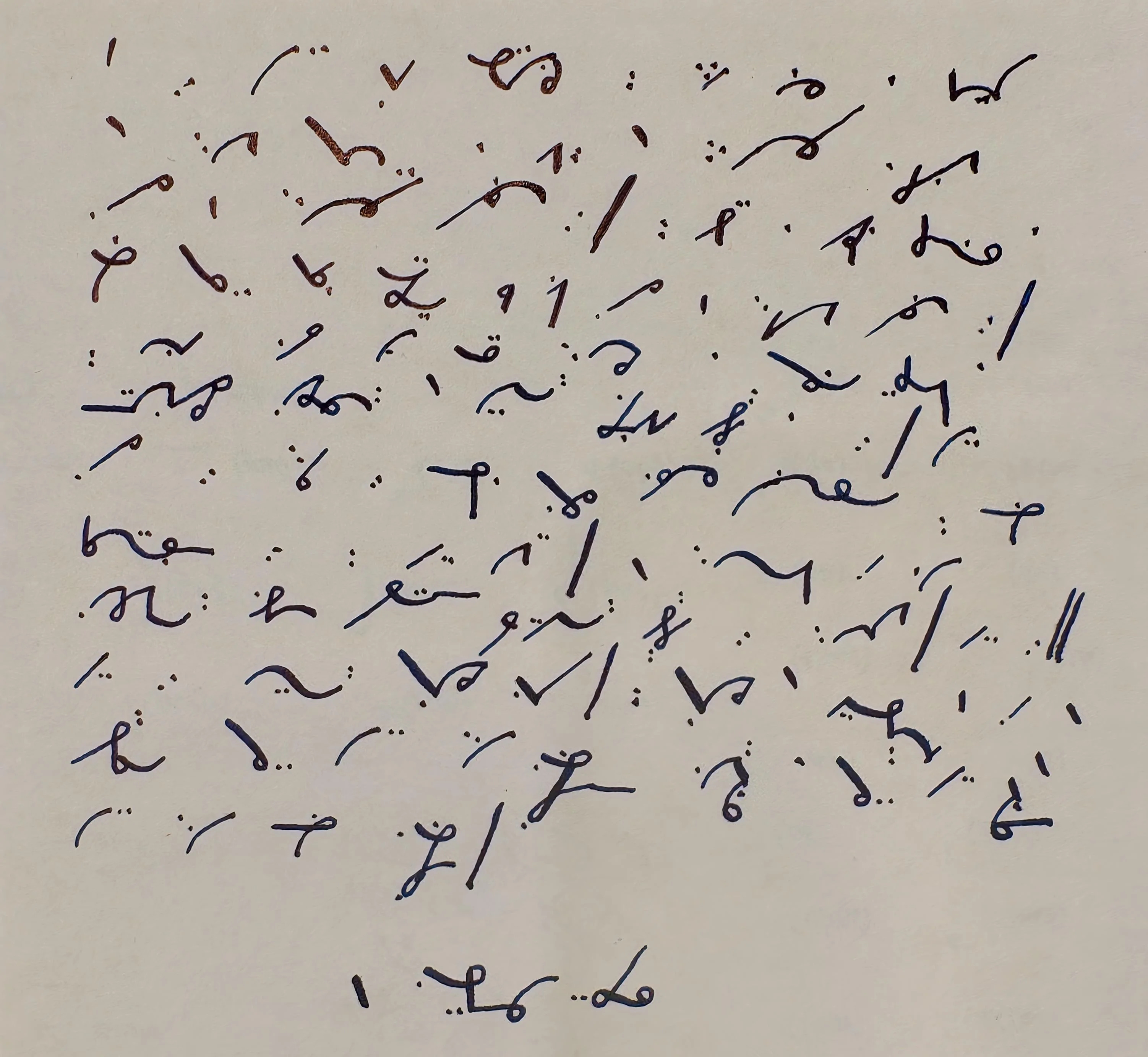
Thomas Hill's Shorthand
I love that - unlike his contemporaries - Thomas didn’t feel compelled to try and convince the world that his shorthand was “obviously” the best. He seems to have just made something for himself and left it at that. The only reason we know anything about it is that his estate published it along with some of his writings after his death.
Keep track of your changes
I did two things which really helped me.
The most useful thing I did was to shrink down the key for the Alphabet that you see at the top of this page, and put it in the top right corner of every page I wrote in my tablet. This served two purposes. First, it was a reference for learning. This was especially useful when I changed how a letter was drawn. Second it’s a key to reading things written in old versions of Korthic.
The other thing I did was to keep a change-log of my modifications.
The change-log was useful because - more than once - I considered using a shape for a letter that I’d already tried, and discarded. This saved me from trying it again. It also helped me to objectively see which letters I was struggling with.
It doesn’t even have to be useful.
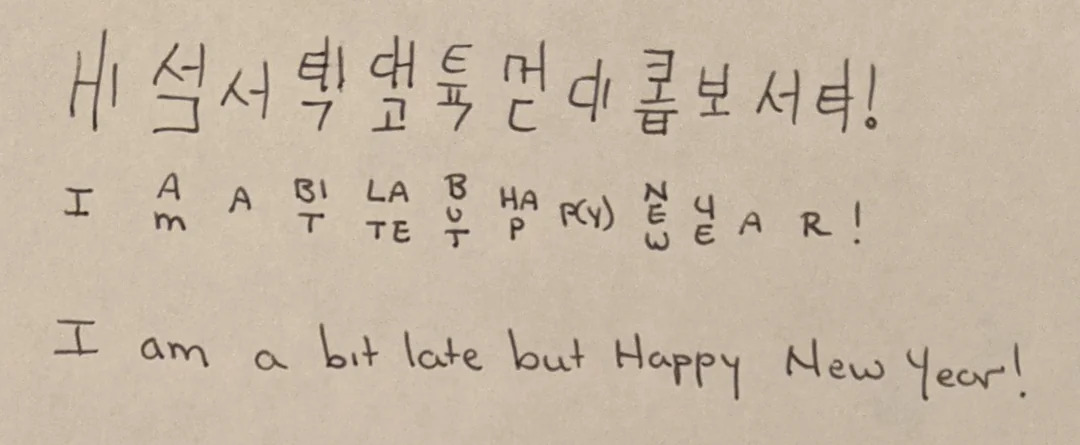
The Neography subreddit is filled with people creating random writing systems they find it fun. For example, check out this Hangul inspired way of writing English that was shared by CPhiltrus.
Hangul Inspired Orthography
Or this “unnamed geometric cypher” shared by LMAONAISE
Unnamed Geometric Cypher
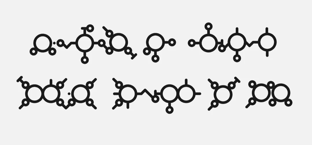
Lots of people create writings systems for their conlangs that no-one will ever use but them. Here’s an example of a font I created for a way of writing my conlang.
Some example sentences in Oho
Resources
Looking Back on Korthic
Creating Korthic taught me a lot. I ended up with isn’t anything like what I started out trying to create, and where my creation diverged from my goals.
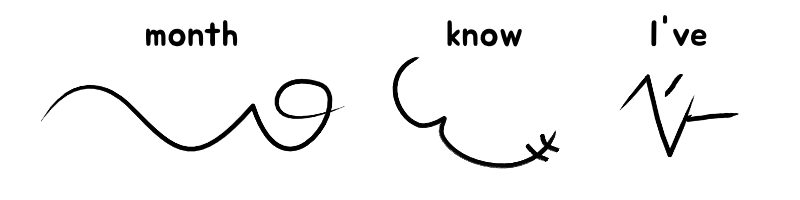
In the image above, you can see that “Month” and “I’ve” are radically different looking words. “Month” has long flowing curves which is what I set out to design. “I’ve” is all straight lines and sharp angles. I was specifically trying to avoid shapes like “I’ve” has. Sharp angles cause motion to come to an abrupt stop. The horizontal line on the right was drawn after completing the “V” and repositioning my stylus. That slows things down, and introduces a little more wrist strain. “Know” is somewhere in between with a flowing curve, a sharp angle, and two crossing lines.
Despite all the functional downsides, and the fact that “I’ve” looks nothing like what I was aiming for, I love it. I love the shapes that have emerged as a result of deciding that an “E” is any line that emerges from another at a near-perpindicular angle. I love the way “I’ve” looks. I love that “w” is two crossing lines that sometimes find themselves on curves. “I’ve” absolutely not what I wanted in my orthography, but I had the self awareness to recognize that it made me smile despite going against my rules, and I allowed myself to embrace shapes like that as I designed it.
Korthic is still evolving. The shapes of letters are changing as my speed increases. I’m pretty sure that I’ll reach a tipping point with “d” that forces it into some simpler shape, and the downward motion that “u” introduces is problematic, and annoying. On top of that, I think I want to come up with a phonetic system for writing that sidesteps the insanity of English spelling.
But, I’m proud of it, and it makes my life better every time I sit down to write. I hope that putting it out there encourages someone to try their hand at creating a script for their everyday writing. If that’s you, I hope you have fun. I hope I get to see what you come up with.
If you have questions, don’t hesitate to reach out to me on the fediverse: @masukomi@connectified.com
-
I’m oversimplifying the capabilities of modern fonts, but not by a lot. Practically speaking, unless you’re a font expert, or willing to do something that’ll only be viewable in web browsers with a lot of JavaScript creating a font for something like Gregg Shorthand just isn’t possible. Assume that you can only create fonts for othographies that work / look like languages you’ve seen fonts for already. English, Korean, Chinese, Hindi, Tamil, Arabic, etc. ↩︎