Some of us need bigger text
That sounds pretty obvious. It is pretty obvious. Anyone with any familiarity with older humans knows that they generally have trouble reading small text, or making out fine details. Every drug store has a rack of magnifying glasses. Everyone’s seen an older person doing the thing where they lift up their bifocals and start moving a thing closer and farther with their arm trying to find a spot where it both large enough to be readable but far away enough to be in focus. They’re not the only ones who need bigger text, of course, but they are the ones everyone should be familiar with, and likely has in their lives.
I’m bothering to tell you this, because you, my young friend, with your 20/20 vision, or something close, are building the web sites that I attempt to read, and you’ve forgotten to consider that not everyone has your beautiful and capable eyes.
This post is to give you a glimpse of what the internet looks like for us, & to teach you how to easily see it. Actually fixing the problem is usually quite easy once you can see it. This post won’t be addressing the things you need to do to help users with screen readers, but the techniques I do discuss will help many people who are functionally and legally “blind” but still make use of their screens.
What’s the problem
There are 2 parts to this problem.
The Fundamental Misunderstanding
The biggest, is the fundamental fallacy that the web designer has the final say on how a web page is displayed. They don’t, and this is a good thing. If you choose teeny tiny fonts that look beautiful to you, I can’t read them. If you choose a font with very thin lines, I’m going to still be squinting even when I increase the size. However on the web, the reader has the final say over fonts. We can say “oh, I need it bigger”, or “I like it smaller”, or “I need a font that helps with my dyslexia”. Whatever is comfortable for you is going to be unreadable by some of your visitors, and that’s ok.
The Design Problem
Almost every time I encounter this problem it is the result of a designer trying to put text in a box, but not allowing that box to grow to fit the content. The “box” can take many forms, and is frequently invisible. Sometimes designers allow the boxes to grow to fit the text, but then don’t allow them to re-flow, so they start overlapping each other, or slide off the edge of the screen instead of moving down the page.
Also, I need to specifically call out graphing libraries. Graphing libraries, in general, are terrible about how they handle the text in labels. They fail when it’s too big, or when there’s too much of it. Those same failing result in a product that’s very hostile to people with accessibility needs. In many cases it’s better to just make an image. We can zoom that. Yes, it’ll be terrible for totally blind folks, but most of the time your graph was completely unusable to them anyway.
Some examples:
I count at least 8 different errors in Amazon’s Navigation Bar right now. We’ve got forced box size, poorly handled overflow, assumptions about how tall a font is, and more.

Here’s a pretty typical example of not allowing a box to resize from the State of CSS 2020 web site. In these situations odds seem even that stuff will either be poking out the side like this, or just cut off and unreadable.

From the same site, we have an example of forcing a font size. You can see that regardless of what text size you need (big or small), the graph is imposing its own ideas on what is the “correct” size. The text above the graph, in both images, is the size the browser has been told to render text as. This means that the graph library is likely also overriding the designer’s choice of “correct” size for the page’s text.


The color key in this graph is detached from the normal “flow” of the text and didn’t shift over as the text beside it increased in size.

How to See What We See
“Zoom” is the enemy. Zoom, in its most common form, changes nothing. Your layout looks just as great “zoomed” as it does at the size you designed it at. This is because “zooming” the page is like taking a magnifying glass to it. It’s great for extremely low vision folks, but In the end it doesn’t meaningfully alter anything about it, and makes your stuff so big that much of it falls off the side of my screen.
Many of us don’t want or need your images zoomed. For example: imagine an image of someone holding their credit card out to a store clerk. I don’t need to be able to read the numbers on the card to know that that’s what they’re holding. I can extract all the relevant info from the picture without zooming “oh, it’s an example someone buying something in a store”. Similarly, I don’t want my monitor filled with your “hero image” when I came to read your text.
When a browser forces me to zoom to read the text it also forces me to work in a mode designed for incredibly low vision people (think “legally blind”). It’s great that that’s an option for them, but I just need to not squint at your text.
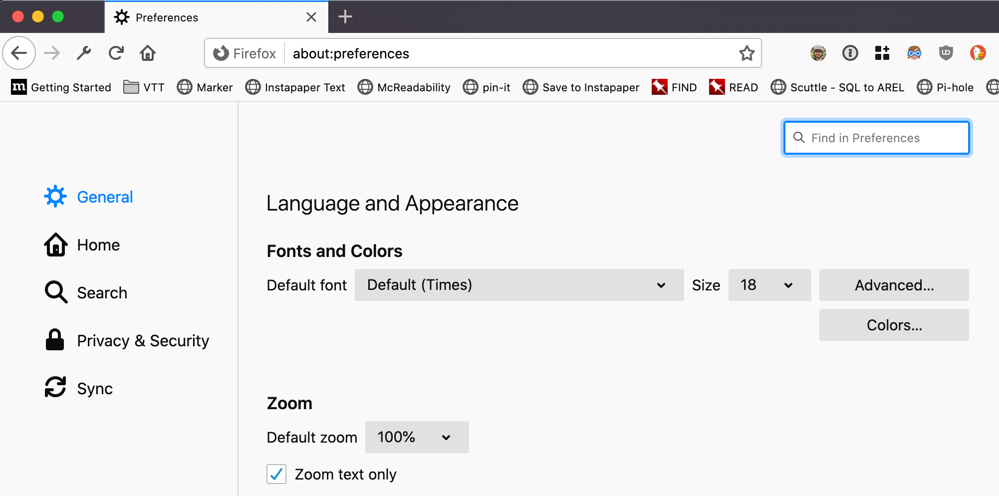
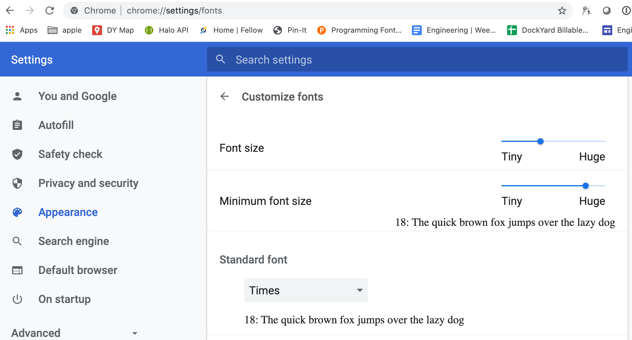
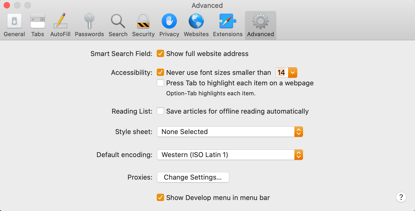
Here are the settings in Firefox, Chrome, and Safari. Note the “Zoom Text Only” checkbox in Firefox. Chrome doesn’t have this.* This is going to make your life, and mine, much easier. Check this in Firefox can now whack Command + (or Control + on Windows) a bunch to see what your page looks like with a fat font, and then Command + 0 to reset it. In Chrome and Safari Zoom will only magnify the whole page. Sadly Safari has no obvious way to set a default font size, only a minimum. If you want to zoom text only in Safari you have to hold down the option key, and click on the “View” menu. Then you will see “Make text bigger” instead of “Zoom in”**. I am unaware of a way to do this without the mouse.
All three have the ability to set a minimum font size. Firefox hides this under an “Advanced…” button. This is significant for designers, because it means that even if you do a great job and make all your font sizes relative to the browser’s base font size, the browser may still use a lower bound that is higher than you expected.


How to Deal
In general, the solution is to let go of the idea of pixel perfect web sites, and embrace “Responsive Design” and Flexbox layouts. It’s never going to look exactly the same on every computer and OS anyway.
The great thing about “responsive” web sites is that when I jack my font up to huge sizes, they just reset themselves as if i were on a device with a smaller screen, which in a way I am.
The other thing that will dramatically help, is to stop replacing the browser’s widgets with “prettier” CSS + JavaScript versions. Pull-downs and multi-selects are the most common example of this. These custom widgets are rarely designed with accessibility in mind, and frequently need to be tweaked to handle whatever your specific use case is. Those tweaks almost never take accessibility into account, because most developers don’t think about a11y. Firefox, Chrome, and Safari have all done a great job of making sure that their built-in widgets work really well for folks with accessibility needs.
As noted above, graphs are a problem. No-one wants to write their own graphing libraries, and few of the existing ones are good at accessibility. Try them out at varying font sizes and with lots of elements and see what happens. Unfortunately there’s not really a good answer here. Using a graph is frequently the right call, they’re notoriously problematic, and writing your own graphing library is almost always the wrong call.
As far as sticking text in boxes though. That’s not actually a problem. There are lots of good reasons to do it. Nav bars, grouping, highlighting a specific thing… These are all reasonable design decisions. If you need to use a box keep these things in mind:
- Make boxes that expand in a controlled manner with the text within them.
- If expanding the box isn’t an option, don’t just cut off text and make it impossible to read. Make it obvious that there is text that isn’t currently being displayed, and provide a mechanism to easily read it. For example, have scroll bars appear when contents overflow. They are there to help people read.
- Avoid CSS’s
overflow: hiddenproperty when dealing with text, unless you provide scroll bars. It almost always results in cutting off the text and leaving people like me unable to read whatever you wanted us to read.text-overflow: ellipsislooks better, but the intended text is still cut off. - if clicking an item causes a sub-menu (or whatever) to be displayed, make sure that that sub-item is anchored to the boxes current location, not some hard-coded number of pixels or
emspaces across the page.
Summary
There are millions of folks who have visibility issues, and you’re likely to become one as you age. So, embrace responsive design. Use native widgets, and never try to make “pixel perfect” designs.
If you’ve got more suggestions on how to improve sites for low vision folks please contact me and I’ll add it to this page.
Footnotes:
* Chrome doesn’t have the built-in ability to zoom text only, BUT there is a Zoom Text Only plugin which over 10,000 people have installed. There are probably many thousands of other users who didn’t know this was an option, or weren’t tech savvy enough to even look for something like this.
** Not it is not reasonable to expect anyone to “just know” that holding down the option key when clicking on a menu will change its contents.